Will Non-Merit Giving Selective LACs Need to Change to Attract High-Income Students?

Not exactly an answer to your Q, but a rough generalized estimate of the amout a family is expected to pay per year is:
20% x (income - expense allowance) +
5-6% x (parent non-retirement savings + capped value of primary residence + other assets) +
25% x (students assets - $5k? allowance)

This is for CSS schools. The allowances and % can be tweeked as desired by the schools but those are the starting points. So, once you have relevant parent assets above $1.5m or so, no fin aid for you.

3 Likes

One might guess this is because Case is so generous with merit that it’s (practically speaking) in the same price range as an OOS public, therefore its distribution would look a bit more like a public?

1 Like

This is a little complicated, but one observation I have drawn from looking at a lot of college budgets is basically all wealthy colleges, including wealthy privates but also highly resourced publics, basically spend considerably more per student on student-related things than even the full pay rate would cover (for publics, I mean full pay in-state).

In that sense, every such college “leverages” your parental contribution. The leverage is coming variously from gifts/endowments, grants, state subsidies, OOS cross subsidies, and so on.

OK, then full pay privates cost more, but the leverage amount can be even higher. Like at a quality public you may pay $50-60K and they spend $80-90K. $90K+ for a private is a lot more, but then they may spend $150K or more.

To me this helps explain what is happening with those wealthiest families. Why not spend more if it gets leveraged up that way? That’s just an efficient way to spend some wealth.

Conversely, a wealthy public system is still great value in-state, so if that is what you can comfortably afford, then maybe that is the best choice for your family.

Of course the best deal going is then a wealthy private with a ton of aid. But again going back to that full pay case, merit may be a factor, but it might take a lot to really move the needle.

Like Colleges A and B both cost $90K full, but A is generally wealthier so spends $160K per student, versus $120K for B.

So B offers $20K merit. Is spending $70K to get $120K better than spending $90K to get $160K? Not necessarily, not if you can comfortably afford it.

Obviously all this is abstract hypotheticals, but those are not necessarily unrealistic hypotheticals. And I think knowing this can help make it a little easier to understand why the wealthiest parents seem so attracted to being full pay at the wealthiest privates.

That kind of economic analysis is predicated on the assumption that school spending per student determines outcomes or quality of experience, and I don’t this is a given.

1 Like

I remember having this conversation years ago and arguing whether the NYT graph looked more like a candy cane rather than a barbell. :smile:

1 Like

Where would we find average amount spent per student on individual college websites? Thank you for the information and analysis shared above.

I think the biggest reason the wealthiest parents are willing to be full pay at the wealthiest privates is because of the social connections. It’s like country clubs; the real reason isn’t because of the tennis courts or pool or greens (as nice as they may be), it’s to make a social network with people who can afford the country club.

But yes, I agree that wealthy schools can do a lot of fun extras like paid research opportunities, cool study abroads, special food etc.

3 Likes

This might be off-topic, so we can split this out somewhere if need be, but it’s something I’ve been curious about. What do the highly resourced colleges actually spend money on that enhances the student experience?

In particular, my D26 has been looking at both Haverford and Swarthmore. They both have great curriculums, the ability to spend money on professors (Swarthmore is more, of course), various expenses paid for summer labs and internships, etc. I would have thought financial aid, which would/should draw more lower income folks into the fold, but the NYTimes data doesn’t seem to quite bear that out. I actually struggled to understand what the additional dollars that Swat spends went to that might directly impact students on campus experience. Funny thing was I was listening to Your College Bound Kid where they were comparing the two schools with an admissions officer that had worked at both. The admissions officer noted that when the Swat admissions office had a party, it was a really nice spread with high quality food, etc. while at Haverford it was more bare-bones. It’s a single anecdote, so I’m not taking that too seriously, but it’s interesting to hear about where the money goes.

1 Like

Where would we find average amount spent per student on individual college websites? Thank you for the information and analysis shared above.

The colleges discussed here are non-profit organizations, so increased endowment per student (and related returns) and increased private gifts generally corresponds to a portion going to increased spending (in addition to a portion going to endowment). One can look up specific information in IPEDS or in the college’s financial docs. As an example, a comparison between Princeton and Rutgers is below. In this example year, Princeton had ~$245k total revenue per student vs ~$59k for Rutgers. And Princeton had ~$200k total spending per student vs ~$48k for Rutgers.

Investment Revenue per Student – Princeton = $151k, Rutgers = $7k
Private Gift Revenue per Student – Princeton = $49k, Rutgers = $3k
Gov Grant Revenue per Student – Princeton = $25k, Rutgers = $15k
Tuition Revenue per Student – Princeton = $13k, Rutgers = $14k
State Appropriations Rev per Student – Princeton= $0, Rutgers = $15k

Instruction Expense per Student – Princeton = $71k, Rutgers = $16k
Research Expense per Student – Princeton = $45k, Rutgers = $11k
Institutional Sup Expense per Student – Princeton = $36k, Rutgers = $5k
Academic Sup Expense per Student – Princeton = $27k, Rutgers = $7k
Student Service Expense per Student – Princeton = $16k, Rutgers = $2k

However, I doubt that the primary reason why top 1% type kids favor Princeton over Rutgers is they expect Princeton is a better buy, with more student spending. I expect more influential are things like perception of the respective colleges and what is encouraged among community/HS/family/social group. This may be indirectly influenced by the college’s spending in things like USNWR ranking, which is largely a function of endowment/spending per student and influences public perception.

2 Likes

One answer is curb appeal. A lot of families from Sunbelt states, where a large number of the 1% make their homes, arrive on some of the older campuses Back East expecting a lot of glass and steel and a lot of lush landscaping; they are spectacularly unimpressed by any building more than 20 years old unless it specifically resembles Hogwarts - and sometimes not even then. Thus, you have Amherst currently constructing its second student center in - well, 20 years - even though Amherst has only grown by a few hundred students. There are countless instances of wealthy East Coast LACs willing to take on tremendous debt in order to keep their campuses looking like country clubs.

3 Likes

The 1% isn’t the question at hand, though. It is the top 15-20 percent(ish) - the “regular wealthy” that seem (anecdotally, and in some data) to be selecting out of the T50, likely due to net cost. The 1% can, and do, go wherever suits their fancy/whim.

1 Like

I think Rutgers may not be a good stand-in for “a very good but not tippy-top public”.

Here in NJ we are spoiled for choice - there are plenty of very good-to-excellent schools within 3-4 hours drive (including 3 Ivies within an hour’s drive). Not unlike students from many other states, the highly-ambitious students look down upon Rutgers as “high school 2.0” and prefer to go elsewhere - and here they are able to because of the choices they have. This, combined with a widespread mindset of “any private is better than a public”, leads to students from wealthy families picking schools other than Rutgers, even if those schools are arguably not as strong as Rutgers.

I’d therefore be curious to see what these graphs look like at say, UW Madison, or U of SC, etc.

3 Likes

Fair point. I looked at other NE publics (Binghampton, Stony Brook, UConn, and the U Pitt system) which had similar results to Rutgers - a big drop off at the highest income. But southern publics that attract NE students might be different.

I was replying to a different discussion, but none of the previously posted income distribution graphs show this income range missing or having an abnormal distribution. Top 15-20% doesn’t have as large an overrepresentation as the higher incomes beyond that where most are full pay kids, but I don’t think the primary reason for this is cost.

At high endowment per student Ivy+ type colleges, top 15-20% income is often a range where the Ivy+ college is less expensive than in-state public alternatives. It depends on the specific college, state, and financial situation. Example stats from Yale are below. Top 15-20% income corresponds to the $150k to $200k group in table below for which 92% qualified for FA, and median cost was $27k/year.

I expect the greater degree of overrepresentation at higher incomes beyond top 15-20% than top 15-20% has many contributing factors rather than one simple reason. Some of these contributing factors include:

  • A greater degree of encouragement from community/family to apply to and attend Ivy+ colleges. This is particularly present at private HSs and magnet HSs.
  • Legacy, athlete, and special interest list admission preferences
  • Other holistic admission preferences, particularly test scores
  • Better school support on average, including better/different admission counseling

But if he never saved anything ever (i.e. consumed every dollar of income every year), then the addition of a $25k per year college bill may feel like a financial struggle for him.

I don’t either. Ultimately whether the product a given college delivers is worth more, less, or about as much as the cost it takes to deliver it is one of those very personal, aka subjective, decisions.

I usually just google something like the name of the school and “financial statements”. Typically I have quickly found informative documents. But determining a spend per student is not necessarily uncontroversial.

That too, but it is interesting to think about why they would not have collectively exerted more competitive pricing pressure on these colleges, if hypothetically they did not like the terms of the deal. Perhaps it is a collective action issue. Perhaps it is collusion by the colleges. Or perhaps they have leveraged the fact that their continued patronage is de facto a big part of how these institutions perpetuate themselves over generations to get themselves a very good deal.

Again whether or not it actually enhances the student experience is a potentially personal issue. But we can look at their budget documents to see what is actually happening.

OK, so here is Haverford:

Swarthmore:

Focusing just on the operating budget, Swarthmore in FY ended 6/24 had total operating expenses of $241,109,000. That was spread over around 1641 FT students (and 3 PT, but that’s confusing), so about $147K per student in operating expenses. Again this doesn’t include capital expenses aside from depreciation and interest on debt.

Haverford had $127,177,000 in operating expenses, about 1419 FT students (and a few PT I will again ignore), so about $90K per student.

Looking at the categories, by far the biggest contributor to that approximately $57K/student difference was salaries and benefits. If you do the math, Swarthmore spent about $85K per student that way, Haverford about $53K, so that is $32K right there. General operating expenses was then about $44K to $26K (+$18K), depreciation was $13K to $7K (+$6K), and interest was about $5.4K to $4.1K (a little over +$1K).

Pausing, this is pretty typical from what I have seen, meaning a lot of the additional spending by the wealthiest colleges goes to salary and benefits.

OK, so what is actually in those categories? Well here is comparable charts from the Notes. Swarthmore:

Imgur

Haverford:

Imgur

The biggest overall category at both is Instruction, and it is particularly big in salary and benefits. That is one large chunk of where Swarthmore spends more. There is also a big difference in Academic Support, Auxiliary Services, and finally Institutional Support. In contrast, they are actually quite close in terms of Research and Student Services.

What is all that stuff? You can’t really tell from these documents, and I have not tried to dig down further for these colleges.

I am reminded of when the 8th grade families at our K-8 only private school toured local HS options. As to one of the most popular schools (which ended up our own S24’s choice), a joking-not-joking meme developed: “at least you can see where the money went.”

I know a lot of people’s initial reaction to all this is skepticism, but to be clear about the real world mechanisms, I am not suggesting a lot of families are digging into financial statements and calculating leverage rates.

But I do think in many, many ways, these schools find ways to communicate to their target market “this is where the money went”.

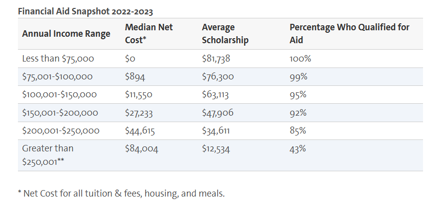
Again I am not sure the data I have seen actually supports this narrative. It certainly didn’t back at the time of the Chetty Study/NYT data, meaning there was no indication of an unusually low matriculation rate in that range.

Yeah, long ago my first deep dive into all this was surrounding our planning when our S24 was just an infant (and already by then, the concept of a donut hole was popular).

The consensus among the people who seemed to know what they were talking about (always a controversial topic itself) was basically that assuming relatively decent investment returns over a long enough period of time, those returns will likely outstrip the marginal decrease in aid. Like the typical assessment rate is something like 5% annually, and in most longer-term scenarios you should easily be able to cover that out of returns.

In other words, long term college savings worked in the sense you would indeed be better off financially after paying for college having saved that money, although of course that is not putting a value on what else you could have done with it if you didn’t save it.

I note another consensus takeaway was you should usually save in retirement funds first, since they were typically not assessed. Something like a 529 could be a good idea, though, if you had already maxed out retirement funds.

But then psychologically? My two cents is it is relatively easy for people who have savings in 529s to go ahead and spend those on college. But even if you have the same overall savings, if more of it is in retirement funds, or net home equity, or something else not so obviously earmarked for education, some people may find it harder to write those big checks.

2 Likes

Swarthmore does have a somewhat higher enrollment in majors whose faculty are likely to be more expensive due to competition from industry (computer science, engineering, economics), but it is not dominated by those majors. Haverford does have a higher number of math majors (another subject where hiring faculty may have to compete against industry).

1 Like

I previously mentioned that all highly selective privates all seem to show a similar pattern, with increasingly large enrollment as income increases. However, public colleges are not as consistent. There are several different types of patterns. For example, the graphs below show the highest USNWR ranked public colleges that are available in the NYT graphing. The distribution for top 1% kids is all over the map.

  • Some colleges show a pattern much like the selective privates, with increasing enrollment as income increases, particularly among top 1%. Examples include Michigan, UVA, and UNC: Chapel Hill. I believe U of SC is variation of this, but with much less steep slope.
  • Some colleges show variations of increasing enrollment as income increases except for same at 95th percentile and top 1% (Case Western pattern). Examples include GeorgiaTech and Florida. I believe Wisconsin is a variation of this, but flattening closer to 80th percentile.
  • Some colleges show increasing enrollment with increased income, except for decrease at top 1% (Rutgers pattern). Examples include Ohio State.
  • Some not super selective publics show roughly flat income income distribution, then increasingly fewer wealthy students above 85th percentile income. Examples include New Mexico and South Florida.
  • The UCs strong preference for lower income is reflected in roughly flat distribution until ~85th percentile, rather than increased enrollment with increased income. However among very wealthy domestic students, the pattern changes based on selectivity/perception. Berkeley and UCLA have increased representation as income increases. UCSD and UCD have increased enrollment at 95th percentile, but decreased among top 1%. UCI and UCR have flat enrollment at 95th percentile and sharp decrease among top 1%.
3 Likes

Thank you! Very interesting.

Apologies if I missed this up thread, but what is the source of this data? How can I look up schools myself?

Just by way of supplement, the Chetty paper broke out in-state versus out-of-state data for some select publics. Here for example is attendance rates controlled for test scores:

Imgur

OK, so overall if you look at, say, Michigan, at least in this era it had an overall graph that looked somewhat private-ish, peaking at a 2.4X rate in the top 0.1%. But then when you discomposed that, in-state it was way more flat, only 1.2X at the top. Necessarily, then, OOS it was even more peaky at the top, 4.2X (although the “winner” in this category OOS was Georgia at 5.9X).

And I would again suggest at a basic level, this makes a lot of sense. Meaning basically, a lot of the point of colleges like Michigan having OOS programs is to get marginal revenues that operate to cross-subsidize the in-state students.

Again, although this is technically not about LACs, I think it is indirectly illuminating. At least in this era, things like the Oberlin graph I linked looked a lot like Michigan’s OOS graph (unadjusted at least). And that in some sense is Oberlin’s competitive set–obviously other privates, but also prized OOS programs.

But I don’t know if an Oberlin or such can actually afford to try to compete against Michigan IN-state for a lot of higher-income students, not on price at least. Because they actually need the revenues they are getting from those families, because unlike Michigan they are not getting state subsidies, have fewer scale efficiencies, and so on.

So if anecdotally some higher-income families are choosing a good in-state option over being private full pay–I am not sure there is much that colleges like Oberlin could actually afford to do to try to change that.

But they are competing against each other, and similar private research universities sometimes, for the higher income students who are willing to pay more for an alternative to their best in-state option. But that competition is bounded by their own financial circumstances and needs.