<p>DISLIKE:14 </p>
<p>LIKE: 1 (dmd77)</p>
<p>NO VOTE: 1 (abasket) </p>
<p>I will say I can deal with it if it is at night and my lights are off, but dealing is not liking!</p>
<p>DISLIKE:14 </p>
<p>LIKE: 1 (dmd77)</p>
<p>NO VOTE: 1 (abasket) </p>
<p>I will say I can deal with it if it is at night and my lights are off, but dealing is not liking!</p>
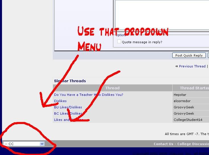
<p>You all know that at the bottom left of the page you can change back to the old display, right?</p>
<p>YEP check post #2, but it is good that we keep reiterating it since it can get lost in the thread very quickly.</p>
<p>re; post #2. Had to click on fresh, then “CC” form the tab to convert back to the old colors. </p>
<p>Thanks for finding the link and sharing with us!!</p>
<p>Thanks, I never noticed that button before. I think the old version is easier on the eyes.</p>
<p>NO VOTE: 1 (abasket) </p>
<p>Wait a minute!!! I have a vote - it just depends if I’m home or at work!!! :)</p>
<p>(teasing!)</p>
<p>I do not like the “new” format. GO BLUE!!!</p>
<p>Thanks for explaining how to change the colors. I found the light blue on white to be hard to read.
Black on gray is much easier to read. Old eyes maybe.</p>
<p>I like the new colors. The site no longer looks like it was made in 1995 or something. And actually, the majority of pages that I see tend to have a lighter background, anyway. Especially news pages. And, you know, ordinary books.</p>
<p>Glad I’m not the only geezer whose eyes can’t handle the bright background of the new format. Even more glad there’s such an easy solution. Feel very badly for those who spent much time and energy on the new design. Been in their shoes (but without the fallout).</p>
<p>I think the new color design doesn’t have enough contrast. I reverted back to the old.</p>
<p>
</p>
<p>Ordinary books aren’t backlit.</p>
<p>I just gave it a second chance and nope, can’t stand it. The color in the lettering looks washed out, like my printer when it’s running out of ink. Rather annoying to look at. I couldn’t peruse the site for more than a couple minutes before changing it back to the gray background. Much better.</p>
<p>It is actually very close to what Yahoo and CNN use. Both have white backgrounds. It is very widespread.</p>
<p>They could, however, make the blue a bit darker to help with the contrast. Gray backgrounds go back to early html and do feel very dated to me as well.</p>
<p>I seem to be in the minority, but I like the new colors.</p>
<p>^^^Yeah, but retro is cool.</p>
<p>On my screen, the blue in the writing looks faded and washed out, like when the printer is about to run out of ink. It’s distracting in an annoying way. I agree that darkening the blue against the white background might help, but I still don’t think I would be won over.</p>
<p>I really have become addicted to the CC blue…weird huh. Mildly hyperventilated until I realized I could revert back.</p>
<p>thanks so much for explaining how to change the color back!</p>
<p>If you’re still having trouble finding how to switch back and forth, hope [url=<a href=“http://i206.■■■■■■■■■■■■■■■/albums/bb26/Iam3elliott/CCmenu.jpg]this[/url”>http://i206.■■■■■■■■■■■■■■■/albums/bb26/Iam3elliott/CCmenu.jpg]this[/url</a>] helps.</p>
<p>Seems to be pretty universal - wonder if there is any thought on the part of the powers that be of changing back to the old colors as the default…</p>
![http://i206.■■■■■■■■■■■■■■■/albums/bb26/Iam3elliott/CCmenu.jpg]this[/url](http://i206.photobucket.com/albums/bb26/Iam3elliott/CCmenu.jpg%5Dthis%5B/url)