Guys, how do you feel about renaming Parents Cafe/Parents Corner to The Social Lounge? I feel like this is more inclusive and ties better with what we want to include here.
Also, we added some imagery and played around a bit more with the categories and this is my proposed final look for the homepage redesign: College Confidential Forums - Admissions Discussions and Threads *
** Again, make sure you are logged in with your CC credentials to actually see the changes.
Let me know your thoughts! Appreciate all the great feedback!
If the social lounge is for parents (as the parent Cafe is)…perhaps it should be called The Parent Lounge.
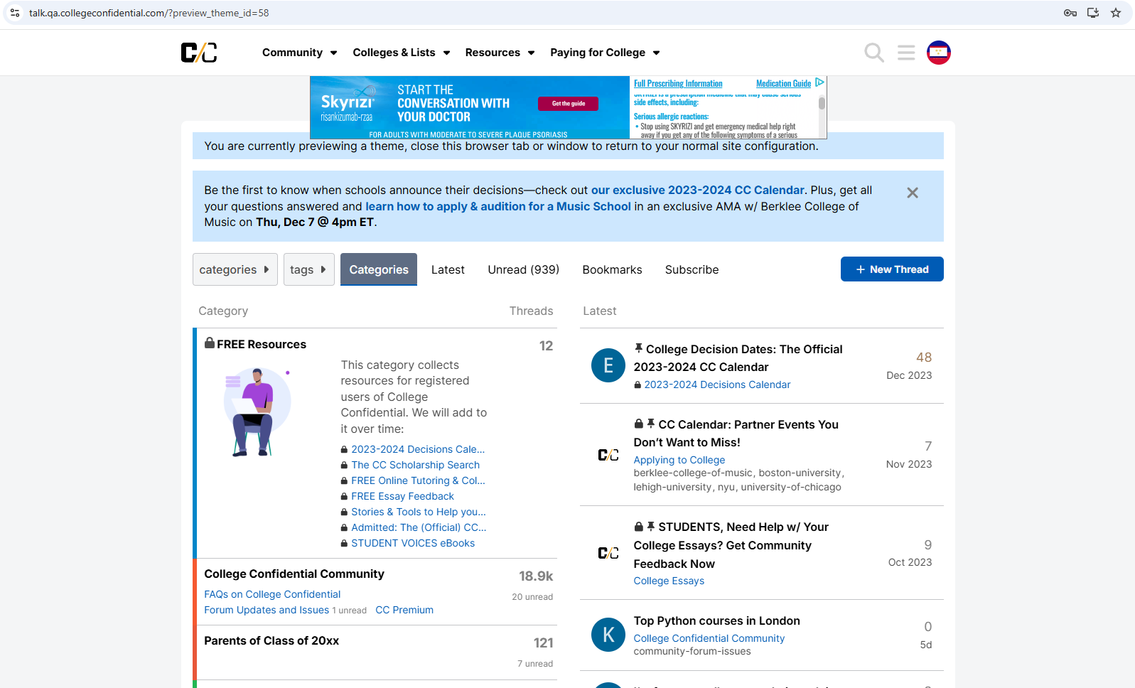
Please disregard the content, different fonts, colors, small colored boxes near every category. The theme will be applied to the live site and will match everything you see here.
1 Like
Thought Social is more inclusive and makes that section for everyone (though it will mostly be parents of course).
2 Likes
I do think the images help break up for the text for those folks who aren’t into text-heavy sites.
I would move College Confidential Community down in the order of things, unless it really is the 2nd most popular forum. I would imagine it’s one of the least used ones, including by new users, but I’m not looking at any analytics, either.

I understand why we’re doing the Chance Me/Match Me, but I might alter the wording a bit. I don’t think that anyone in here “knows” what a student’s chances are, so maybe…“Want to know what others think your chances or admissions are?” for that part? “Need help thinking of schools to apply to?” might get at the idea that people are offering folks suggestions, not telling them where to apply in terms of the Match Me section. And I would remove the part about “post stats” because folks need a lot more info than just stats when chancing (hence the template that’s provided), and I think it puts the emphasis on something that can lead to some unhealthiness in students.
And I understand that the forums are supposedly organized by popularity, but the order really doesn’t make any sense to me. I’d probably just gather them by category, perhaps something like this:
College Confidential
Getting to College
-
Test Preparation
-
Paying for College
-
Prep School Admissions
-
Pre-College Issues
Applying to College
College and Beyond
-
College Majors
-
College Life
-
Pre-Med & Medical School
-
Pre-Dentistry & Dental School
-
Pre-Pharmacy & Pharmacy School
-
Pre-Vet & Veterinary Medicine
-
Graduate School
-
Career Opportunities & Internships
-
Colleges & Universities
Find Your People
-
Parents of Class of 20xx
-
The Social Lounge
-
International Students
-
Athletic Recruits
-
Transfer Students
-
State Forums
3 Likes
This is really valuable feedback, thank you for the thorough input, @AustenNut!
While I really like your structure, there are a few technical issues to consider:
- Discourse only allows for a 2-tier structure. Many forums (like Test Prep, P4C, Prep School Admissions, College Search & Selection, College Majors, etc) already have sub-forums. This means we cannot put them under another bigger forum. The only solution to keep their subforums is to make them a main forum.
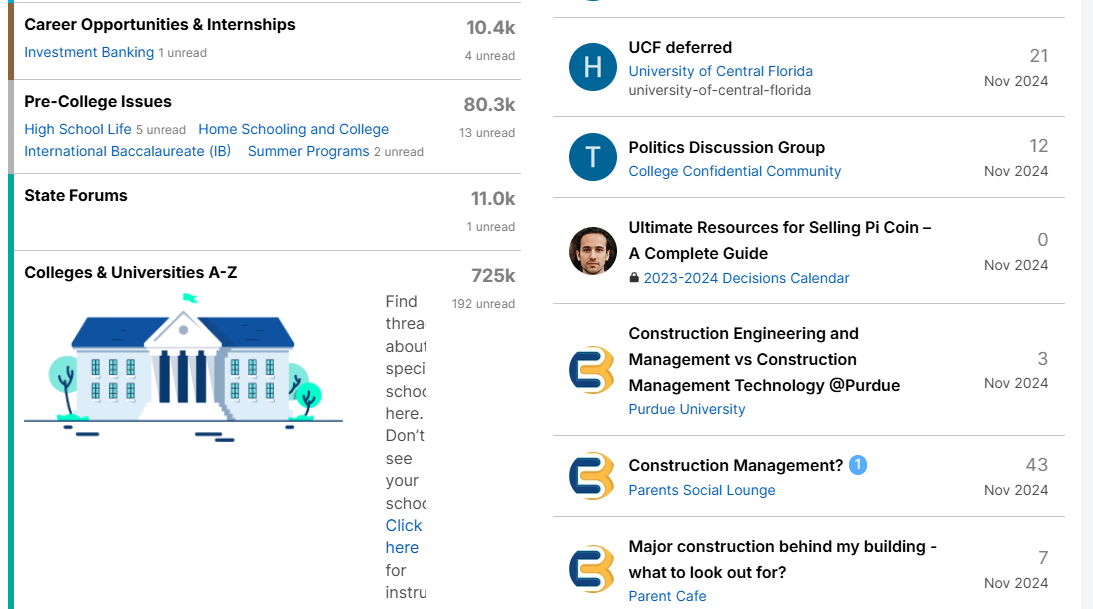
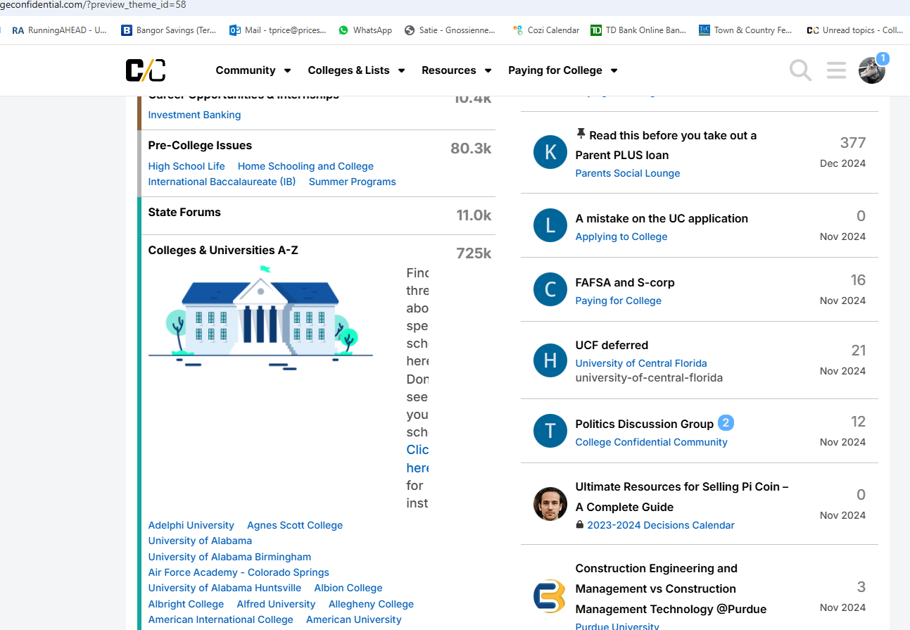
- Some of the categories you mentioned are already removed (like Archives, State Forums)
Huh, interesting, because I thought I was only pulling from the test site!
Is it possible for the “larger” categories to have the same background color to create a visual tie even if they aren’t an official category, so that the forums/subforums still show up?
I like the idea of adding graphics and colors to break up all the text. However, it needs to have a cohesive look. Too many different styles and colors can be difficult to follow. The first thing I see when I look at the new page is that the spacing and formatting is different in each section. Is that still a work in progress?
I also think the wording needs a lot of help. As AustenNut mentioned, it needs to be clear and accurate.
To a new user, what does the following mean? Shoot, I’ve been on this site for years and even I don’t know what it means. Am I a registered user? Or are registered users those that subscribe? It says “free” so I’m assuming it is for everyone who logs on. If so, why are the threads locked?
This category collects resources for registered users of College Confidential. We will add to it over time:
I don’t like the word “challenges” in this sentence. I would come up with a more positive description.
Discussions for the unique challenges faced by international students. For specific countries, click here.
This sentence doesn’t fit next to the graphic on my 24 inch monitor. I get 4-5 characters on each line. As you can see, it is cut off at the end.
Find threads about specific schools here. Don’t see your school? Click here for instru
Why does UChicago have a green check mark with an info bubble next to it? Are you planning on doing that for all schools?
2 Likes
Ok, I just confirmed, and both of these are still on the test site (pictures below).
I would get a narrower graphic for Colleges & Universities or do something so that the text for the description actually fits. Like @lkg4answers, I’m viewing this on a pretty large monitor and it’s cut off.
I think that so long as additional categories are listed on the left, there should continue to be the latest threads on the right. Otherwise, I suspect that it’s very possible that people may stop looking at available categories once they see that there are no new threads on the right. Essentially, I’d keep the categories and the new threads at the same length.
And apologies for my terrible mouse handwriting.
1 Like
@AustenNut, can you please confirm you are logged in with your CC credentials? The view you are showing is the one for not logged in users (who cannot preview the changes). Thanks!
Since my avatar is showing in the upper right hand corner, I’m pretty sure I’m logged in with my cc credentials:
Yep, just did it again. Same view as above.
Can you try to log out and log back in? And then access the link again: College Confidential Forums - Admissions Discussions and Threads
I’m seeing the same thing as AustenNut when I log into the second site.
3 Likes
@lkg4answers, that’s very weird. Not sure what’s going on. To confirm, you were seeing the changes at one point, right?
I went to the test page and logged out and closed the browser tab. I then used the test link again to open in a new tab. I then logged in on the new browser tab, and I got the same image. In case it helps anything, I included the web address bar with this snip.
I’m also seeing the too-large image for Colleges & Universities A-Z
1 Like
I used the link, logged in, and still see “State Forums.”
1 Like