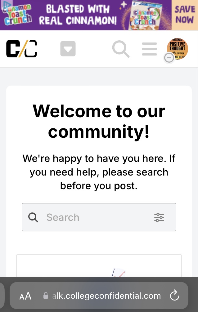
Is the big banner and icons supposed to appear even if you have “Latest” as your default?
I’m used to just clicking on the C/C logo in upper left of the site to jump back to the top level “Latest” thread listing. Now when I do that, my entire laptop screen is taken up with the big welcome banner and big icons, and I have to scroll down to start seeing threads.
Edited to add:
I’m also seeing the big welcome banner taking up most of my laptop screen when I go to the “Unread” screen. Again, I have to scroll down before I start seeing actual threads. Is this intentional?
Could there be a preference to suppress the big banner so I don’t have to see it every time?
Another poster who didn’t see this until just yesterday. I appreciate trying to engage us.
I’m not sure I understand the first 2 above. Does that mean each thread may show up both in the sub-category AND in chronological order below the sub-categories?
Yes. So if you are in the Parent Cafe you see all threads (from the main Parent Cafe category + all subcategories) in chronological order. If you go to the subcategory “Food” let’s say, you will only see the threads from Food, in chronological order.
Regarding the “big banner” at the top of pages: After the recent changes, I went into my “preferences” to check things out. Under “interface”, the first item is “theme”. There were two available, and I switched to the one that wasn’t currently selected, and I no longer see the big banner. (It was especially annoying on my phone - took up about 2 full screens worth. Changing the theme fixed that - yay!)
Good catch. I just tested this on my phone and it worked for me too.
I did NOT check the box to apply to all devices, therefore, my phone now is set to the old theme but my computer uses the new theme (which is my preference). Just pointing that out so others know it is an option.
The old theme may not be available for long. We kept it as we just finallzed the redesign a few hours ago. I will have to check internally if we can keep that as an option going forward.
I really hope you can keep some option that doesn’t display those pictures. I understated it before. They take up a full 3 1/2 screens on my phone before I can scroll to actual content. I really don’t understand what purpose they serve. Do some people prefer to scroll past pictures before getting to the content? Can’t you reduce them to a more compact row of icons at the tops?
I’m not sure how you normally interact with CC. Can you use the caret at the top next to the CC to jump to the forums you want? Or maybe use the hamburger menu on the right to select LATEST.
My default view is “categories,” which gives me a big picture view of the whole forum and lets me see at a glance which of the subjects I’m interested in have new posts. That still works great for me with the “old” theme, but if that goes away, it looks like I’ll have to scroll past a whole bunch of pictures to get to the actual content.
On my phone it’s about 2 1/2 screens to scroll through. On my laptop, a bit over one screen. I did notice I visited cc a bit less today because it was annoying. Maybe good for me () but not sure it’s good for cc?
To change your theme: go to your icon at the upper right. On the right of that drop-down, at the very bottom, there’s a sort of head & shoulders icon. Under that there are several options. Pick Preferences , then Interface. (You might have to scroll right to get to some of the options.) You should be able to find Theme from there.
I could not (easily) find where to post this. Move as needed. I REALLY don’t care for the new changes to the parent cafe format. Instead of the two categories (regular cafe topics vs. political topics), my screen now merges all of them into one long list. Perhaps some viewers prefer this? I prefer the separation. Sometimes I’m just not in the mood for one, and it is so much harder to separate when they’re all blended together. If it’s not broken… (i.e. WHY the change? Perhaps if I understood better)
Just chiming in to say I read CC exclusively on my phone, and for me, there are virtually no changes :-). I also always start with “Latest Posts” so that may have something to do with it. In any case – all is good from my perspective!