It did it when I opened this laptop. It wanted me to log in again too, of course. I refreshed the site a time or 2 and it logged me in but I still had that error message on the main screen which had Bullwinlke’s “whatsamattaU” logo on it, LOL
What blue icons? Everything looks the same (well, I have the “Whoops! There was an error” message persistently floating bottom left as I type this- and it keeps moving position,) except for the annoying large header and footer. The footer really distracts from working in the Reply box- imo, because it’s in greyscale and the size- Lenitus, it really distracts the eye- no other site I work on has this sort of so-large footer that demands attention. They’re usually far more discreet. Now I have to add a step of moving the slider to hide it.
I got an odd fail yesterday on the laptop- I had CC up on two tabs and when I clicked on one, got the error message for no apparent reason, something like what jym notes in 178 - “Oops! An error occurred.” I just closed the tab and the other was fine, nothing to report. I forget exactly what, as I am (unfortunately) now somewhat de-sensitized…(did I say, unfortunately?)
Thanks for listening.
…after posting this and refreshing, the light bulb error msg did go away- and for now there is a large white space between the Reply box and the bottom banner.
@lookingforward…I was referring to the icons that were once blue…but are now white (the ones near your username at the top right). When I posted my message earlier the view was a bit different, but now things are complete. Annoying large header and footer, you say? I don’t believe the header area is much different size-wise than it was, though is now solid blue. A more refined look, no?
As for the footer, perhaps it is your display, but as I’m writing in the reply box here I don’t even see it. It is well below the fold. Many sites have very large footers, though perhaps it is the solid grey that you’re not accustomed to.
Not sure what is going on with the Oops error a few of you have received. That was more common shortly after the site transition.
Ah, okay. I found a thread where the footer is in close proximity to the reply box. It honestly doesn’t distract me, and I’m not just saying that since I’m an admin the site. Also, this is my first time seeing the finished product with this new header and footer, so I haven’t gotten accustomed to it as it was being conceptualized and tested. I think it’s similar to the “sea of white” many complained about when the site was re-launched, but the grey doesn’t hurt your eyes, does it? I am confident you’ll adjust to it
Aw, come on, @jym626…what’s one more time getting logged out? Seriously, though, we’ll see if these oops messages clear up. I’ll make sure our product manager is well aware of them. Glad you at least got a chuckle out of the “whatasamattaU” logo
The teal is pretty. Not appearing on my cell. Nor the footer. I never complained about the sea of white.
Yes, it’s the grey of the footer that bugs. And the size. And the font size for its titles and their bolding.<br>
On other threads, it was about a half centimeter under the preview-save-post bars. I checked a few. Now, on this thread, eg, there-is-no-space-at-all. Ie, unless I move the reply box down so it is at the very bottom of my page (Ie, some extra step,), the contest is between this normal contrast typing space and a monster grey footer. Give us some consistent space to get used to, even an inch- not ask us to just add a few steps. And we know it’s not you, Lenitus.
Have an issue with the header which I’ll skip for now. I will see if the header issue bugging me is something I can adapt to.
That sounds very reasonable. And I do see how the footer has been encroaching upon the reply box more and more. Perhaps we can get some padding in there. I’ll pass that along. Thanks!
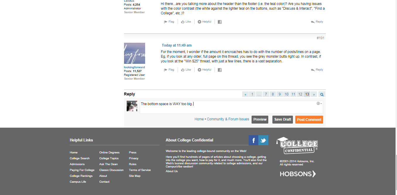
Hi there…are you talking more about the header than the footer (i.e. the teal color)? Are you having issues with the color contrast (the white against the lighter teal on the buttons, such as “Discuss & Interact”, “Find a College”, etc.)?
For the moment, I wonder if the amount it encroaches has to do with the number of posts/lines on a page. Eg, if you look at any older, full page on this thread, you see the grey monster butts right up. In contrast, if you look at the “Win $25” thread, with just a few lines, there is a vast separation.
That’s ridiculous and such a waste of space.
Anyway, my pages are often loading twice. It’ll load, I’ll scroll down, and it’ll load again. This just started happening with the “new” rollout.
Large footers are not all that uncommon on sites, though as was discussed previously in this thread having some padding beneath the reply-to box buttons to separate things out a bit could de-congest the area.
I have not seen an issue with page re-loading as of yet. Have others seen this loading and reloading occur upon scroll?
For the record, it is currently set to 15. On the old site this was customizable at the user level, but here it is a setting on the admin side.
