<a href=“http://i.gyazo.com/a83025694dac57ff8914f7ab65f33faa.png”>http://i.gyazo.com/a83025694dac57ff8914f7ab65f33faa.png</a>
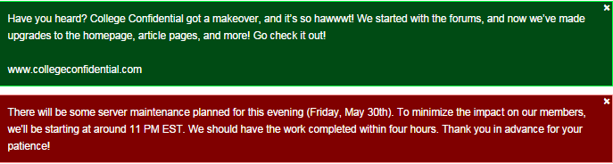
Hey look, we’re time traveling again!
“Hawt” going back to the 90s and the date going back to May.
<a href=“http://i.gyazo.com/a83025694dac57ff8914f7ab65f33faa.png”>http://i.gyazo.com/a83025694dac57ff8914f7ab65f33faa.png</a>
Hey look, we’re time traveling again!
“Hawt” going back to the 90s and the date going back to May.
Perhaps we can put it to a vote.
I am quite sure we don’t. Anyway, I think the “sea of grey” magnifies the effect. Half the page is a bit of embellishment…36% maybe ![]()
LOL…just making sure you’re paying attention. Wasn’t me, but I was told it should be rectified now. There is supposed to be an announcement about the actual new updates.
Surprise! Is it your birthday by chance today, thumper1? ![]()
I’ve seen plenty of sites with huge footers. It’s sort of messy when you scroll to the bottom, but I don’t think it is that horrible.
I doubt it is loading twice, but what can happen is that if you scroll down before the page is fully loaded, it will snap back to the top after it finishes loading.
Check to see if the in-progress thingy is still going when you scroll down.
This is a very common issue I see on many sites. Usually there is some image being served from a different location that is slow to load, or some other widget is loading. Yahoo does this, it drives me nuts sometimes.
Thank you, @notrichenough. I knew it couldn’t just be me who had seen these. And thanks for the input on the apparent page re-loading.
Not my birthday. But I was asked to log in…I hit my back arrow…and poof, I was logged in!
Check out <a href=“http://www.si.com/”>http://www.si.com/</a> , for example.
That site’s layout is horrible… they took their mobile site design and let it drive the design for regular computers, and it just doesn’t work.
At least CC didn’t do that. ![]()
I don’t find the footer at all unusual. And if it did bug me, I simply wouldn’t scroll to the bottom of the page.
ETA. Count me in for more posts per page.
You have to scroll down in order to post…
NRE, it’s not the size, per se, it’s the way it elbows in, when you want to perform an action- in this case, use the Repy box on a page already full of comments. Everything about its formatting, all white against the grey, high contrast- and the large logo- does what I suppose it is meant to: distracts me. Fineee when you need those links and fine for a newbie who doesn’t know the navigating alternatives- but I hate it.
On SI, eg, you’re scrolling down through visuals already, each of them boxed. Then the 3/4" “Load More” option. It’s a different sort of brain response. On SI, you;re already scanning choices of boxed info (As another example, see Harvard.edu.) But on CC, we’re text-oriented, trying to read linearly down a page
Of course, we all know other sites with large footers- but most often the ones I see are black on white, not the opposite.
My issue with the header: when I scroll to the top, eg, to make the My Bookmarks link visible, my pointer is now at the top of the page, abutting the teal box. I can’t just move the pointer over to MyB-- if I cross the teal and one of its link boxes, sheesh, that menu opens, obscuring a good 3-4 inches of the page, including the links I want.
I can’t resist saying, for anyone who knows the recent thread, THIS is why you need liberal arts folks in tech. Haha.
It appears we will be adding some padding to separate the footer a bit from the reply-to box in the next release, by the way. That release would include some other possible updates as well, so it won’t be in the next few days, but hopefully soon thereafter. That might help mollify romani’s anxiety about the footer 
I noticed that, too. The Chicago Sun-Times has a footer that takes up 85% of one page if you scroll all the way down, but it’s a lighter color. I’m sure the darker grey here magnifies it a bit, though I still think you’ll get accustomed to it. Did you see my note about adding some padding to separate it from the reply-to box. That should do something to help.
Thanks for the feedback on this. I’ll make sure our product manager also sees this. He mentioned some header issues that were going to be corrected in the next release, though not sure yet if it overlaps with your issue.
Yes, thx.<br>
I could “get accustomed” to a slightly slower response when flying over one of those header links- as it is now, I even glance the edge and the menu opens.
Lenitus, it helps that you listen to us.
Glad to hear, though my apologies in advance if ever I sound ‘snappy’ in return. I need to stand by our tech team (Hobsons first, then the site vendor) and the community at the same time, and that can be tough to navigate at times.
Yeah, I can appreciate that as I’ve been on sites where it seems that even looking at the menu makes it open. We’ll see if there is a way to desensitize it.
By the way, @lookingforward, I wonder if the sensitivity of the drop-downs differs across browsers. I’m actually finding I can pass over them on my way to the other side of the page without causing the menus to open. The speed of the cursor is not unreasonable either (i.e. it’s not so fast that the cursor is hard to see as it moves).
Well, I’m on chrome, fwiw. And unless needed, I;ve sid what I needed to and can be quiet for a while.
Ha…that’s okay. I will try a few different browsers myself to see if there are differences in behavior of those menus, by the way. We may look into other options for how those menus respond as well. Thanks!
Is it possible to increase the space between those notification icons and the dropdown boxes? The cursor seems to pull down the dropdown even when I am pretty sure I’ve put it on the icon
I see what you’re talking about. Probably could benefit from some breathing room there. We can certainly consider de-congesting that as well. Thanks!