That makes sense. But I don’t see a problem if both are being discussed.
@CC_Sorin you want parents of young children discussing home schooling options, etc? I’m not sure that should be the focus of this forum. BUT helping these families navigate what they need to be successful college grads should be…in my opinion.
My vote is for an apostrophe on Parents’ Lounge.
I don’t have strong feelings, but think that Home Schooling is good without the college part. Within a forum named College Confidential, I doubt that there will be a flood of people with young children inundating the site as their first resource on home schooling a young child. But there are folks here who may have younger children and want to talk through/think about some of the issues if they’re thinking about homeschooling. And if CC ends up being a place where more people are coming and interacting and sharing diverse viewpoints (i.e., what is the point of an education? What skills/habits/knowledge are important to develop to be successful in college/career/life? etc.) then I don’t think that’s a bad thing at all. I’d actually think that’s a good thing.
2 Likes
@AustenNut, I think so, too, the “college” part can go.
@thumper1, I think anyone can discuss home schooling. We really shouldn’t limit. The reality is that no children will come to CC to talk about this, but parents can have generic homeschooling discussions that are not necessarily tied to college.
If we really want to make it about college admissions I could move it to the Applying to College forum.
On enhancing the visual separation between the Category and Latest fields, perhaps try: varying the widths of these two fields; color their backgrounds slightly differently; format the items ‘Category’ horizontally with small icons for each and limit this field to occupy no more than half the page height; vary the fonts for the titles of the posts under ‘Latest’ and the headings of the items in ‘Category’.
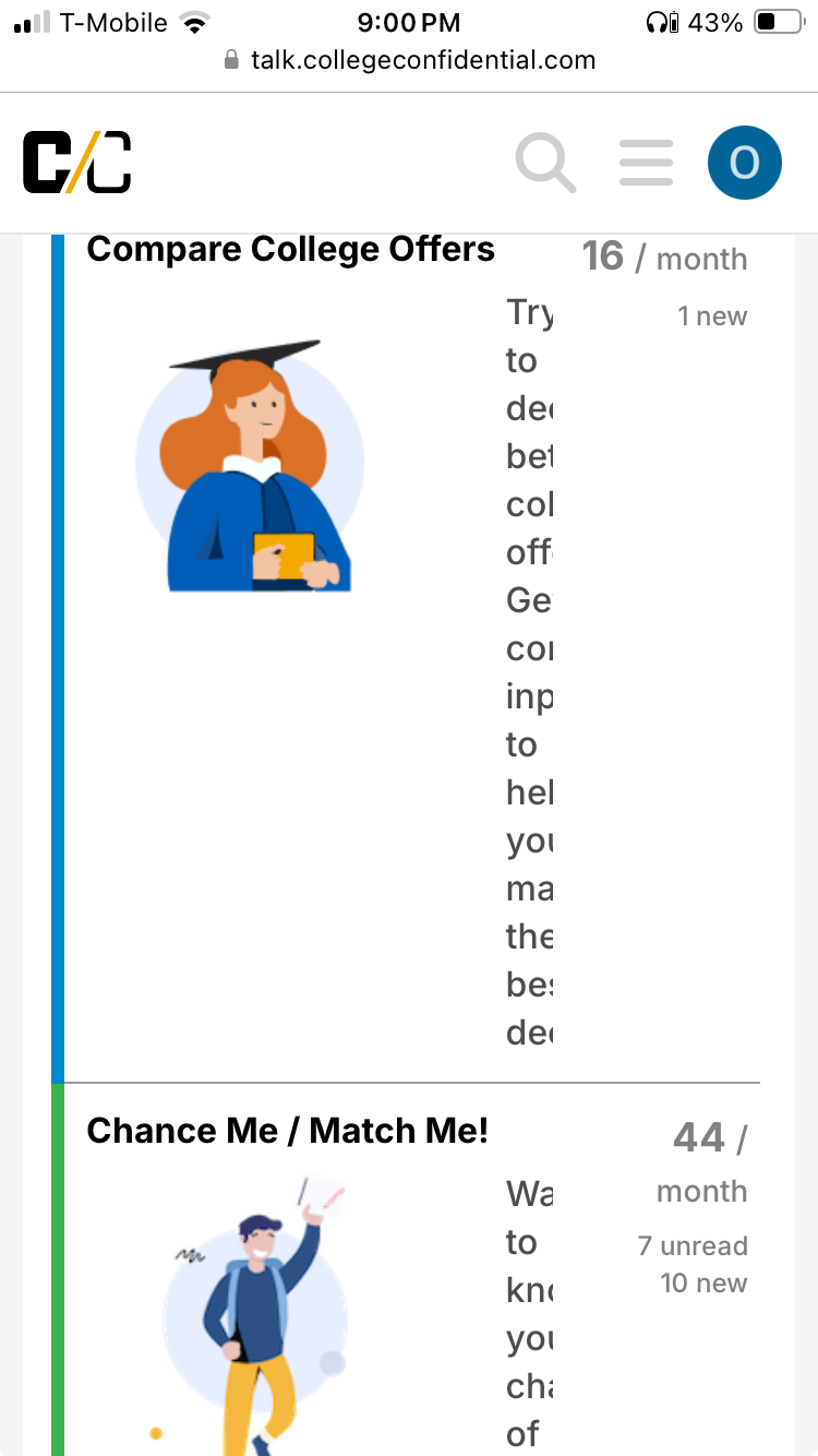
I find the user icons in the ‘Latest’ field to be too big, and do not always help to provide categorization; for example, users excited235 and emmawitson are both represented by an identical generic E until the mouse is hovered over it.
Is the intention to have an exhaustive listing of all subtopic in each of the topic/items (26 of such by my count) on this page?
That Pre-College section doesn’t get much activity. Maybe instead of Pre-College Issues, it should be Pre-College Planning.
High School Life sounds like a social forum. Maybe the sub forums should be
- High School
- Prep School (Would it be more appropriate in this forum? Would that make it difficult to find or would it bring more activity to Pre College Planning? Does Prep School need three subforums?)
- Home School
- International Baccalaureate
- Summer Programs
Should IB be moved to be with AP?
ETA: Technically, I think this section is for pre-application planning. However, I think that name would be too confusing. Maybe the description could say something to indicate that this space is for pre-application discussion. A lot of those questions end up in Applying to College.
When you look at what drives people to this website, can you see the most searched for terms? Certainly “applying to college” has to be one of them. What about “planning for college” or “how to get into college”? Maybe those phrases could be used in the Pre-College section.
Should we start moving HS questions from the Parents Forum to Pre-College/High School now or do you want to inform people first?
I would suggest that the move happen when the redesign is launched.
3 Likes
Can you please do something about the huge increase in pop-up ads? Particularly the ones that seem hard to close and that block text. This is the kind of attribute that will drive users far away from CC… Thank you!
2 Likes
Along those lines, I’m still trying to close the blue notification box. ![]()
I have a ticket for this, but it does look like they are not able to fix the issue. Will continue to push for it though.
1 Like
Taking @AustenNut’s proposed structure we managed to add some dividers and tell a more coherent story of our forum structure.
You can check the proposed final homepage redesign here: https://talk.qa.collegeconfidential.com
We are ready to move this over to the live site, so please review and give me your final feedback. You will see some wonkiness, but everything will be solved once we migrate.
As previously announced, one big change is that all college-related discussions from the Parents Forum will be move to the appropriate forums, while Parents Cafe will be renamed to Parents Social Lounge and will be expanded to include more subcategories (including PF, which will remain an opt-in category).
3 Likes
Outside of some wonkiness which I’m assuming will be fixed, I think it looks good!
1 Like
Just curious if developers are testing this on a small screen. Is there some way to omit the pictures or optimize the text when the device is smaller than a certain size?
2 Likes
Quick feedback on first glance.
Looks much cleaner. I like the font.
You have four headers. How much do you expect the Decision Calendar section to be used? It seems to me that it will just be announcements but no real discussion. That is prime real estate for something that doesn’t get as much action.
I would consider changing the word “issues” in Pre College Issues to discussion, conversations, or something more positive. People with questions might be reluctant to post in a subforum meant for those having issues.
It wasn’t immediately intuitive that I needed to search for College & Universities A-Z under categories and then choose individual colleges in the sub categories section. Maybe you can guide people to searching that way in the “start here” thread.
I see categories in a box, tag in a box and then categories again. Maybe the second categories should say something like homepage or forum home.
2 Likes
@O2BonCC, the category icons should not show on mobile (only on desktop). I am not seeing them when I test. Can you please confirm what device you have used to have that view?
@lkg4answers, I renamed this to Pre-College Topics.
The calendar is one of the best resources on CC so we want to give it more visibility. However, the 4 boxes at the top can be changed to match the academic year. We will remove the calendar from the highlights in April and will add something else in that spot.
I added the category description to display at the top of the page. Does this help? https://talk.collegeconfidential.com/c/colleges-and-universities/77/none
Can you send a screenshot to know exactly what you mean?
1 Like
That screenshot was taken on an iPhone SE, (2020 version, I think). But I can’t seem to recreate it now. I can’t even seem to navigate to that section of the site. Maybe it was something that got adjusted since I was looking at it last night.
1 Like
OK. That would make sense as we do not show the category logos on mobile.
