Congrats on the updates! It looks like the emojis are now using a library of some sort, rather than the native-to-device emoji? For what it’s worth, I much prefer the native client emoji.
2 Likes
Are the colored bullets supposed to mean something? I find them confusing and distracting, since I naturally want to try to figure out the significance of the different colors… Apologies if this was discussed above, I haven’t followed the whole discussion.
@tamagotchi, there won’t be colored bullets when we launch this to the live site. ![]()
1 Like

I agree with @lkg4answers on this. Perhaps we could switch the word “challenges” to something like “situations” or “circumstances?”
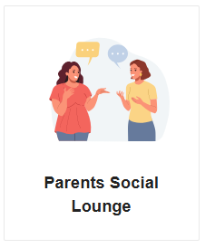
On the Parents Social Lounge, it would be great if there was an apostrophe.

On the page for Parents Social Lounge, it might be good to have the topic title somewhere at the top and not just the icon. (Same for all the pages, like Parents of Class of 20xx, Prep School Admissions, etc.)
Additionally, I don’t know if this is wonkiness or if it’s something that needs to be fixed, but the threads in blue to the right of the subcategories seem confusing. Is there a way to have this be like the regular home page and have the Social Lounge categories on the left and then all the most recent threads on the right?

1 Like
@AustenNut, this is done.
Done!
This is on the To Dos list, we will add a description for all major categories where we have an icon.
Technically that’s not possible because there is a different set up for a category page (which is what PSL is) vs. the homepage.
2 Likes
Got it. Took me awhile, but I finally realized that these blue threads are the latest topics in the Parent Cafe and the Politics Forum and that there are no threads in the Travelling and Cooking section. It might make it more understandable if the threads for the Parent Cafe aligned vertically with those of the Politics Forum (see picture below).
Also, is it possible to use a slightly darker gray as the separator line between the subcategories? It is such a light gray that I originally didn’t see it until I was drawing imaginary lines to suggest lines to separate the subcategories and their threads. Also, I’m assuming that the lines for travelling and cooking would appear if there were actually threads in those areas, but if not, it’d be great to add separator lines here, too (where my dashed lines are).
I don’t know if admin plans to do this, but adding a few existing threads to the Travelling and Cooking subforum may be helpful so that there are signs of life there that would attract more people.

Additionally, at some point there might need to be some clean-up of how threads are categorized. For instance, in the Parents of Class of 20xx topic, there are threads that do not relate (highlighted below).

1 Like
Is the new redesign visible to everyone who just signs in w/their CC credentials?? Because I know my username and password and I keep getting the ‘incorrect username or password’…why is that? Plus when I sign out of the current CC & then log back in to ‘test’ my password being right, it is right and I can log in here. Strange…
Edit #1: added image, alt text, and password followup
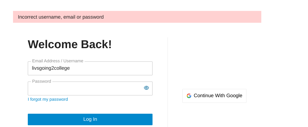
and yes, I am putting in my password BUT I blurred it for the sake of privacy!
I encountered this issue yesterday, typing my credentials in several times…until I realized that a dongle I had plugged into my laptop had accidentally been hitting a key while I typed. Once I fixed that, my credentials worked fine! (Hoping that a simple fix like this will work for you, too. Otherwise @CC_Sorin will need to come to the rescue ![]() )
)
1 Like
This staging environment should be visible to anyone, even those who are not signed in.
1 Like
I wish that was my issue! ![]()
I dunno, I mean yes–I can see the new format regardless of being logged in..but I like the comfort of being signed in (personal preference)…but hopefully if and when the link changes to that officially I can sign in!
ETA: funny to say this, but I tried to search my username in the search bar and there were no results found. Maybe I’m a ghost on the new CC? I wonder what happened to me…
1 Like
Is there a way to make the image for Colleges & Universities slightly smaller so that Chance Me/Match Me does not look like the following on a desktop?
Chance Me / Match
Me!
Or maybe remove the exclamation point and go with Chance Me, Match Me (with a comma).
1 Like
Or “Chance / Match Me”
@lkg4answers, I am working with our design team to have same sized logos for all the categories and hopefully this will correct some of the issues.
However, the size of the boxes on desktop is dynamic and depends on your screen size. We may have a solution (through coding) to address this but that’s still in discovery.
1 Like
I haven’t read many of the comments above. I like to see all of the threads in Parent Cafe (I don’t care at all what it’s called) without having to click through multiple sub-categories to find something. I browse through what’s out there, and click on what sounds interesting.
3 Likes
Why can’t it be:
Parent Social Lounge
No need for an S at all with or without an apostrophe.
I have not seen this thread previously, and jet lag prevents me from reading the whole thing, so apologies for any comments that have already been made. To me, changing to thread groupings and calling some social” seems to somehow have a bit of a derogatory connotation. People know what the cafe is, and IMO leave it alone. Whats the difference between the parents corner, cafe or social?? All very confusing. Are there that many people who don’t understand that the cafe is for things not specifically addressing college planning? It could have academic discussions in it. That, IMO, isn’t ‘social”. LD issues are academic for the most part, so should stay there, IMO.
And now two threads about random issues not needing their own thread have been conflated and given the “social” label? Questions in the thread do not have to be “social”. Please leave it alone. IM best to merge the newer thread into the longstanding one with thousands of posts, and dont degrade these topics by labeling them as purely “social. Thanks
2 Likes
And I think you should be consistent.
It’s Parents Forum and Parents’ Social Lounge
Why aren’t they the same?
1 Like
It’s a shame you started this discussion on a forum page that most users never go to. And that we are only directed to look here and give input AFTER the changes have taken place.
THAT doesn’t seem like the “modern” way to communicate… ![]()
So far the old Parent Cafe is a big DISLIKE for me. I’ll give it a couple days before expressing too much but ill say…why mess with the Parent Cafe name? I mean it’s one thing to mess with the content structure but what is to be gained by changing a literal page name? - that described it EXACTLY.
5 Likes
Good point. Why not call it the parents academic forum or parents educational issues forum (in case people aren’t clear what belongs there) and then the parents conversations forum (or what have you).
Did you read the first post of this thread? It was started over a month ago and he said,
I wanted to open this up to all those who want to participate in this exercise. Your feedback is highly valuable and I want us to be working together to make sure the end result matches the community needs and wants. So just let me know your thoughts below!
It has been a work in progress with and no changes have taken place yet.
4 Likes