I have a different view? Why would that be?
Because you’re special ![]()
2 Likes
It’s because you had the “light theme” selected. This was fixed now and you should have the same view as everyone else.
I guess I do. The little colored blocks were pretty but didn’t seem to have any use.
I thought light theme went away!
It did now. ![]()
Btw, if you still see the old view, please reload or log back in and all should be fine.
There was some reason why I had the light theme. At this point, I don’t even remember what that was, but the light theme solved whatever issue I was having. I hope that issue doesn’t return!
1 Like
Weird, I must navigate differently from everyone else, but I’m not really seeing any differences other than a slightly different font. (At this point I’ve been on both mobile and desktop.) Not that I’m complaining!
I was also wondering about the colored squares, but now I’m not seeing them anymore. Did they go away?
Yes. That’s been fixed.
1 Like
Thx. Time suck is back ![]()
![]() … I do emoji from my phone. Lol
… I do emoji from my phone. Lol
I had to redo my password to a stronger one. I guess that’s good. Since Password isn’t really that strong ![]()
![]() (no that wasn’t my password.)
(no that wasn’t my password.)
Hold it. Is it just me or is everyone’s name using a phone like really tiny /small font? Is there a way to make it just a tad larger? Can I make what I see larger? I am using a Pixel phone.
I think that is why I chose light theme when it was available. I liked the font much better. And the size was better too.
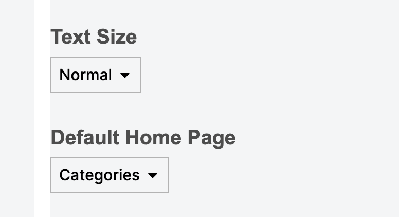
You could try changing the font size by going to your preferences and selecting Larger under Text Size:

(Also, yes, I’m still slightly around for big events like this migration. ![]() Hi everyone! )
Hi everyone! )
1 Like
Thx will try that…
Thank you for saving my eyesight… Lol. Much better.
…
1 Like
Yay!
Right now, seeing a blue dot next to “Latest” on one of the menus means there are either new threads, unread posts in existing threads, or both. AFAIK it is not possible to tell which of the three has occurred until one clicks on “Latest” or “New” or “Unread” on that same menu. Is it possible to make a blue dot appear next to “New” when there are new threads, and next to “Unread” when there are unread posts? That way it’ll save me (and others) a few clicks ![]() . Thanks!
. Thanks!
2 Likes
This one is fairly minor, but since the update, mod notes have some almost unreadable text. Seeing this on mobile and desktop, for more than one mod. Example:

Good catch! It’s the text that says “Super Moderator”.
Yep, I can see that if I zoom in enough, but the way it’s displayed isn’t optimal. Maybe dependent on the theme, but it should really be easily readable in any theme option.
2 Likes